The Chart Therefore Changes
I began this project expecting to confirm that tourism had stopped paying off for the Balearics. The data forced a different kind of honesty: not a different verdict, but a different chart.
The question
Tourism accounts for 45.5% of the Balearic economy, and the islands now rank among Spain's wealthiest regions, GDP per head close to the European average. Older Mallorcans remember a poor, rural place; within a generation it became a tourism powerhouse. From developers to campaigners, left and right agree that tourism rescued the islands from poverty — I set out to test that claim against 125 years of data, expecting it to survive only in a diminished, more troubling form.
It did not survive in the form I expected. The suspicion behind the project turned out to be right; the standard explanation for it did not hold up. I found that out midway through building the piece, and it meant the chart itself had to change what it measured, on screen, mid-scroll — not just the prose underneath it. That change, and what forced it, is what this case study is actually about. The Balearic finding is the evidence; the form change is the point.
This is Mallorca’s accepted economic history. Politicians repeat it. Hoteliers rely on it. Even critics of mass tourism, while condemning the damage it causes, tend to accept its central claim. It is not a fringe position I set out to argue against — it is the default one, held across the political spectrum, and that is exactly why it needed testing rather than assuming.
What I expected
The published version of the piece states the prior cleanly: "This project began with a widely shared suspicion: tourist arrivals keep breaking records, but life for local people stopped improving long ago and may be getting worse. I wanted to know whether that impression would survive contact with the data." That is the question as I eventually put it to readers.
It is not the whole record of what I expected, though. Before that, I had drafted a different piece entirely — an article titled "The Balearic Paradox: Is Tourism Mallorca's Dutch Disease?", built on five symptoms: wages (an average salary of about €23,100 against roughly €31,600 needed for basic expenses), Catalan language decline, early school leaving at 20.1% — the worst rate in Spain despite the region ranking fourth or fifth by GDP — housing at 60.8 years of income needed to buy a home against 29.7 nationally, and environmental strain. I abandoned that plan. Not because any one of the five symptoms turned out to be false, but because none of them, individually or together, answered the harder question of whether tourism itself was the cause of the pattern, rather than merely present alongside it.
One detail is worth stating precisely, since this reversal is easy to overstate in the flattering direction. The relative measure that eventually became the piece's spine — Balearic income against the European average, plotted alongside tourist arrivals — was not a discovery I made partway through. It was already there, as the abandoned plan's opening exhibit. What changed was not the measure; it was where it sat in the argument. A chart that opened a five-part indictment became the chart the finished piece turns on. That form-change instinct was already visible in my own early notes, in language stripped of any tool name: a plan to merge four stepped intro charts into one scroll-driven, animated timeline.
What the data showed
The reversal is sharper than a simple failed thesis. The suspicion behind the abandoned plan survived; its explanation did not. Extremadura is the control case: landlocked, no coast, no Magaluf, no s'Arenal, no beach resorts of any kind — and, as the published piece states, "GDP per head in Extremadura also increased tenfold within two generations." "The same pattern appears in Andalusia, Portugal, France, Ireland and much of Europe." "Tourism was the Balearics’ route into that wider boom, but it was not the boom’s underlying cause."
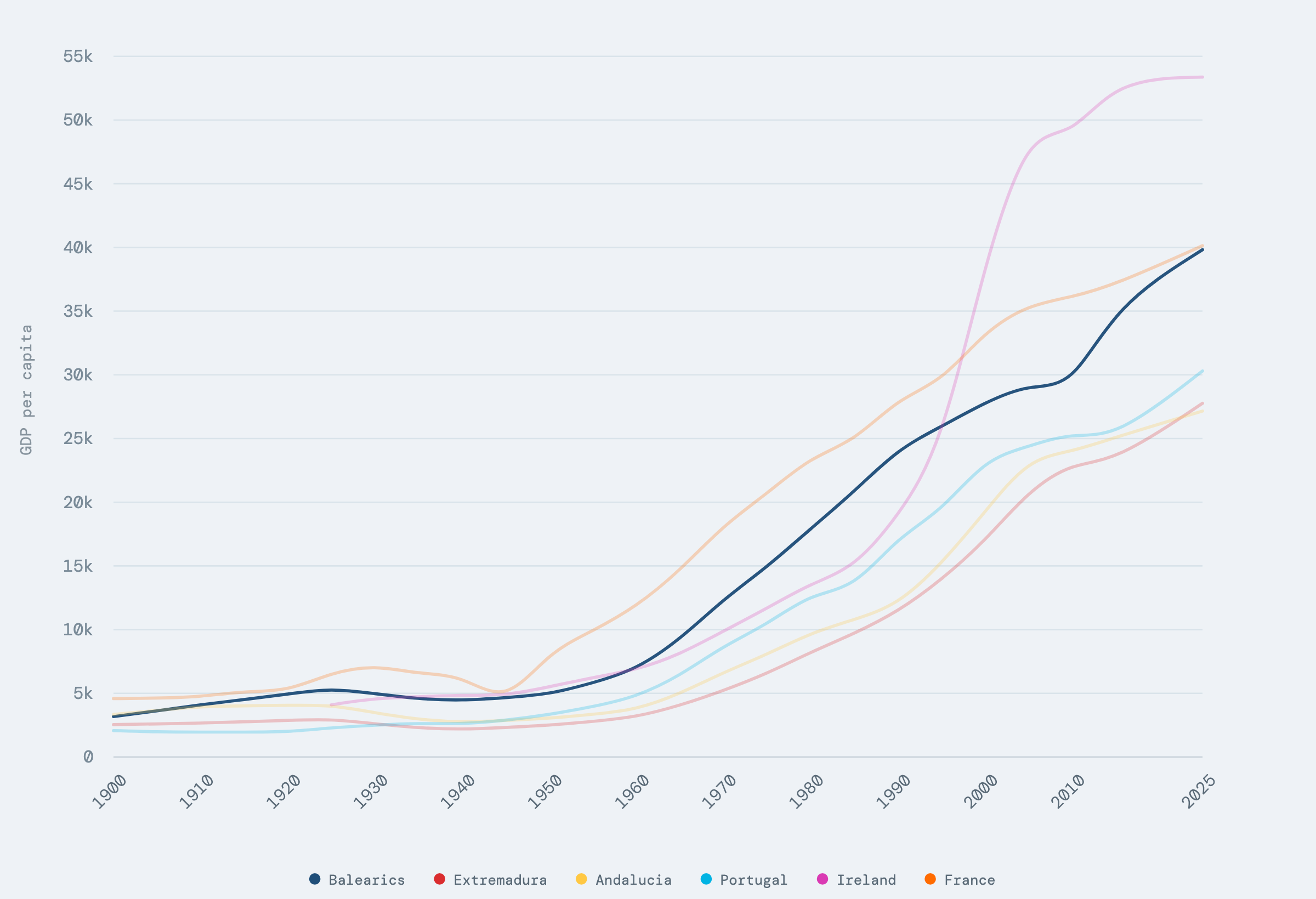
GDP per head in constant 2011 international PPP dollars for six regions and countries, built from the Rosés-Wolf regional GDP database and the Maddison Project.
A second inversion sits underneath the first. Measured in absolute income, the pre-1960 Balearic line looks flat, then takes off — the shape that makes the tourism-rescued-us story so intuitive. Measured against Europe, it does not: "the islands were not exceptionally poor throughout the first half of the century." "It rises and falls, moving above and below the European average." That movement tracks continental shocks — the First World War, in which Spain stayed neutral while much of Europe fought, and the Second World War and its aftermath — more than any local condition. Half of the myth dissolves against a different denominator.
What survives is narrower and stranger than either story: a genuine, sustained rise after 1960 that the absolute chart shows and the relative chart does not explain away. At no point does the piece assert that tourism was responsible for the climb, or responsible for what comes after it. The climb was common across the region; only the eventual fall is distinctly the Balearics' own — and showing that distinction is what eventually forced the measure to change.
Where the chart changed
The chart therefore changes. Instead of plotting income in dollars, it expresses each economy as a percentage of the EU average.
The mechanics, without naming what draws them: the axis stops plotting income in constant 2011 international PPP dollars and starts plotting each economy as a percentage of the EU-27 average, with 100 as the baseline. Reaching for that scale change earlier in the piece would have meant nothing to a reader who had not yet seen the absolute view it answers. The new scale is calibrated on screen against two anchors a reader can hold without a legend: "In 2022, for instance, Ireland stood at 158%, while Bulgaria, the EU’s poorest country, stood at 54%."
The change has to happen mid-scroll, under the same reader, rather than as a second chart lower on the page. The absolute view is not wrong — it is answering a different question, and a chart appended at the bottom reads as a footnote, not an argument. Only a measure that changes while the reader is still looking at the first one makes the argument visible instead of merely asserted in a caption underneath it.
One precision the figure has to respect, and it is easy to get wrong: this is not the same data replotted on a new axis. Switching the measure also swaps the comparator set — the six absolute comparators of the constant-dollar view give way to the Balearics, Ireland, Bulgaria and the EU average, because the new scale needs calibrating rather than populating. The measure changed. The underlying observations did not move; what sits on the page beside them did.
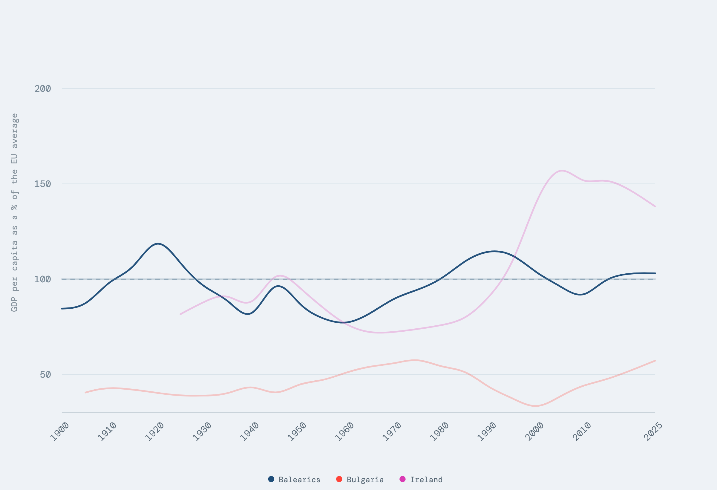
GDP per head as a percentage of the EU-27 average, with 100 as the average, built from the Maddison Project's population-weighted EU-27 series.
What shipped
The finding the piece lands on: "The Balearics stopped gaining ground on Europe in 1993 and have fallen behind ever since, even as arrivals have tripled." Before anyone objects that a small open economy cannot be expected to keep climbing forever against a continental average, Ireland sits on the same chart, on the same axis, climbing hard after 1990. Balearic flatness after 1993 is not a continental ceiling; it is specifically the Balearics'.
The coda is the human cost of that flat line. "It took 25 years from the end of the Balearics’ relative economic rise to the first mass protests against tourism." In the meantime, "More young people are leaving the islands for work—three times as many as in 2009." Record arrivals and a stalled relative income are not a contradiction that needs explaining away; taken together, they are the finding the whole piece exists to show, and the reason the measure had to change on screen rather than sit as a footnote below the absolute chart.
The finished piece — titled, on the page itself, "Everyone in Mallorca Knows It" — ships in several languages. The published piece is online for anyone who wants the full scrollytelling version rather than this account of building it.
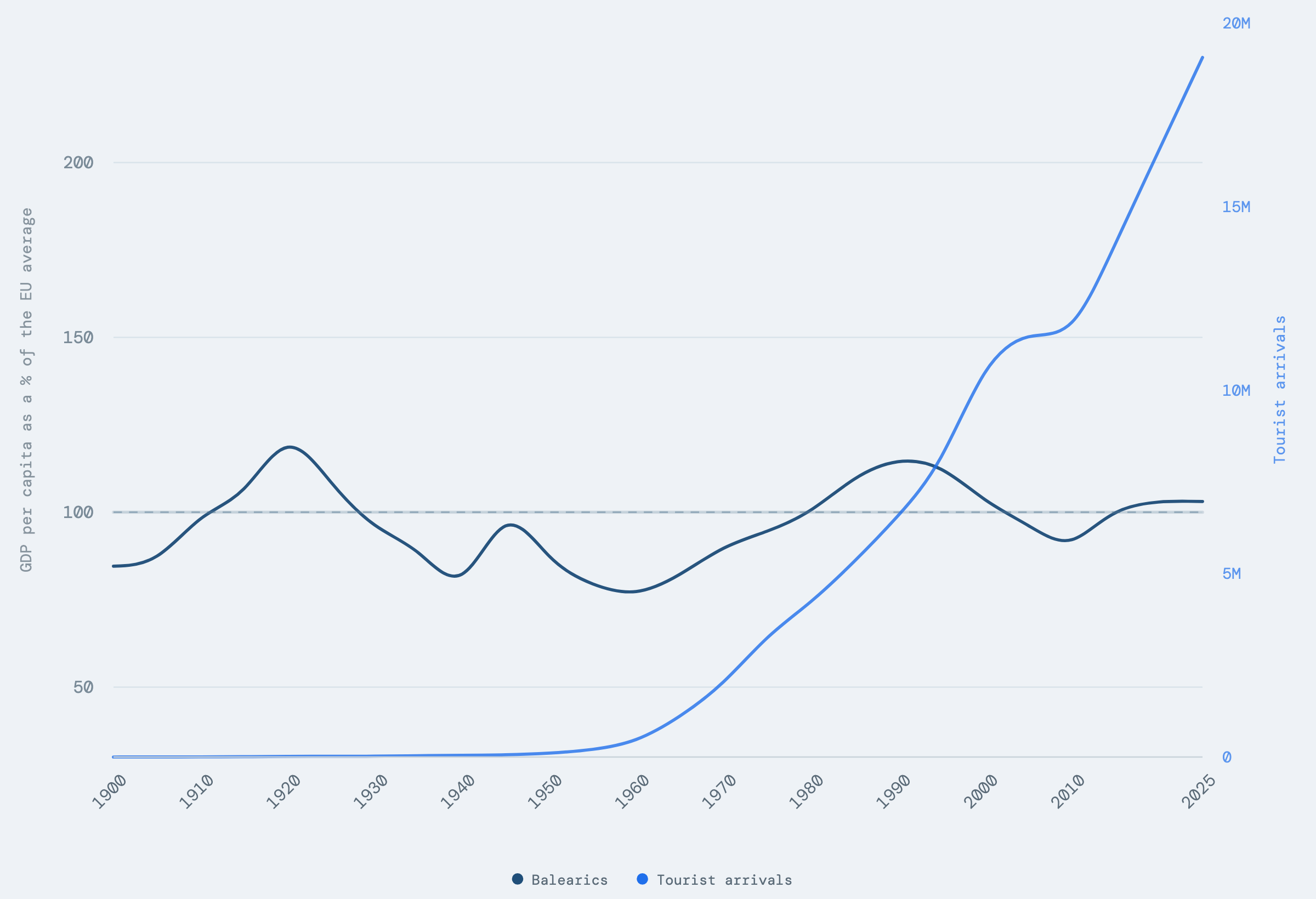
Balearic income as a percentage of the EU-27 average against tourist arrivals, chained from Rosés-Wolf, the Maddison Project, and the AETIB and FRONTUR arrivals series.
Methodology
The GDP series behind every chart in the piece is chained from sources that do not agree on units. Rosés-Wolf and the Maddison Project report constant 2011 international PPP dollars; Eurostat reports current purchasing power standards per person, which carry no inflation adjustment. Joining them is the actual methodological problem, and I tried three approaches before settling on one.
The simplest, a single-year anchor, assumes the relationship between PPP dollars and PPS never changes — which, because PPS carries no inflation adjustment, "would amount to assuming zero inflation—clearly unrealistic." It is also arbitrary: "Using 2000 rather than 2022 changes the estimate by more than 20%." A two-point log-linear anchor removes the arbitrariness, but "This works only if the relationship between PPP dollars and PPS changes steadily—for example, if inflation is constant." The method I used instead keeps every Rosés-Wolf observation as a fixed anchor and rescales the Eurostat-derived profile to meet it at both ends, rather than trusting a single year or a straight line between two.
None of that makes the adopted method obviously superior, and I said so on the published page rather than only in a footnote: "Up to 2020, the simpler single-year method is actually closer to Rosés-Wolf’s real GDP figures, because Rosés-Wolf and Eurostat follow similar paths." The two approaches diverge on the post-pandemic recovery, not before it. I exclude 2020 and 2021 from the chart where sources report them, because "The pandemic was a large but temporary external shock, and plotting those years would obscure rather than clarify the 125-year trend." I use no separate regional deflator, either: "the Balearic index remained within 1% of Spain’s" between 2002 and 2024, though this is an approximation, and living costs on the islands are, in practice, higher. The EU-27 average carries its own seam: it is computed rather than published, population-weighted across today's 27 member states. "Coverage becomes complete in 1985", and before then the countries included vary with data availability, so the benchmark's own composition shifts under the early half of the series, exactly where the pre-1960 claim rests hardest.
The arrivals research cited above exists in three slightly different forms across my own published surfaces; the safest citation is author names and year — Valdivielso and Moranta (2019) — never a volume or issue number, since every printed variant contradicts another.